CSS Float & Position
文档流(normal flow)
文档流(正常流)是 浏览器页面中元素组织排列的默认规则,属于网页的最基层
将 HTML 中的元素在页面中自上向下分成一行一行,并在每行中按从左至右的顺序挨次排放元素,即为文档流
浮动(float)
描述:浮动可以指定一个元素沿其所在容器的左侧或右侧放置,允许其它文本和行内元素环绕它。
属性值:
none(默认值,元素不浮动)left(元素向左浮动)right(元素向右浮动)
浮动元素的定位规则:
当一个元素浮动之后,它会被移出文档流,然后向左或向右平移,一直平移直到碰到了所处容器的边框,或者碰到另外一个浮动的元素。如果父级容器的宽度无法容纳多个浮动元素时,则靠右的浮动元素会移动到与它相临的上一个浮动元素的下面
例:
1 | <style> |
脱离文档流
元素设置浮动后,元素会从文档流中脱离,不在占据文档流的位置,所以浮动元素其后还在文档流中的元素会自动补上文档流的位置
高度塌陷问题
浮动元素会脱离文档流,会导致父元素无法自动计算浮动元素的高度,即子元素无法撑起父元素的高度,这种问题称为高度塌陷。
解决高度塌陷问题的前提是能够识别并包含浮动元素
高度塌陷问题的解决方案
1.使用clear属性来解决高度塌陷问题:
描述:clear属性用于清除指定兄弟元素受到浮动元素所产生的布局影响
属性值:
- none(默认值,元素不清除浮动)
- left(清除左浮动)
- right(清除右浮动)
- both(左右浮动都清除)
1 | <style> |
2.使用::after伪元素选择器来解决高度塌陷问题
例:
1 | <style> |
BFC
块格式化上下文(Block Formatting Context,BFC) 是Web页面中的一个独立的渲染区域(内部的元素不会影响外部,也不会被外部影响),它有一套自己的规则来布局(渲染)子元素。它是Web页面中布局的基础机制之一
下列方式会创建BFC:
- 根元素(
<html>) - 浮动元素(
float值不为none) - 绝对定位元素(
position值为absolute或fixed) - display 值为
flow-root、inline-block、flex、inline-flex、table-cell或table-caption overflow值不为visible的元素
BFC的渲染规则:
- 内部的Box会在垂直方向上从上往下一个接一个的放置,Box与Box之间垂直的间距是由
margin决定的 - BFC 是一个独立的容器,容器内子元素不会影响容器外的元素
- BFC 的区域不会与浮动元素重叠
- BFC 能够识别并包含浮动元素,所以在计算BFC的高度时,浮动元素也参与计算
通过创建BFC来清除浮动:
例:
1 | <style> |
PS:创建 BFC 还可以解决外边距重叠的问题
定位(position)
描述:**position** 属性用于指定一个元素在文档中的定位方式(设置定位的类型)
初始值:static(静态定位)
继承性:No
定位类型:
静态定位:
static即元素在正常流中的位置,无法通
top,right,bottom,left属性改变元素位置相对定位:
relative元素不会脱离正常流,其相对于元素自身的位置进行定位,且不影响布局(即不影响其它元素的位置)
绝对定位:
absolute元素会脱离正常流,其相对于离该元素最近的包含块进行定位
固定定位:
fixed元素会脱离正常流,其相对于浏览器视口进行定位
粘滞定位:
sticky元素不会脱离正常流,且相对于浏览器视口进行定位,默认元素会随页面滚动而滚动,当滚动到相对于视口的指定偏移位置时则元素会固定不动
例1:
1 | <style> |
例2:
1 | <style> |
偏移量
元素开启定位( 即元素 position 属性值不为static )后可以使用 top,right,bottom 和 left 属性来设置元素相对位置的距离,如果不设置则默认位置不变( 即为 auto )
也可以使用 inset 简写属性,来同时设置四个方向的偏移量
语法:
inset: <top> <right> <bottom> <left>inset: <top/bottom> <left/right>inset: <top/bottom/left/right>
如何确定包含块
如果一个元素的 position 属性值为 static、 relative 或 sticky 时则该元素的包含块为它最近的祖先块元素的内容区
如果元素的 position 属性值为 absolute 则该元素的包含块为离该元素最近的 position 属性值不为 static 的祖先元素的内容区,默认则相对于 初始包含块 ,初始包含块的宽度和高度等于视口的宽度和高度
在使用绝对定位 absolute 时,将左右偏移量设置为 0(left,right为 0),并将左右外边距设置为 auto(margin-left,margin-right 为 auto)时,则左右外边距会自动在其所在包含块内等分(即水平居中)
同样,将上下偏移量设置为 0(top,buttom为 0),并将上下外边距设置为 auto(margin-top,margin-buttom 为 auto)时,则上下外边距会自动在其所在包含块内等分(即垂直居中)
z-index
描述:z-index属性设定了一个定位元素( position 值不为 static 的元素 )及其后代元素或弹性容器子元素的 堆叠顺序。通常来说 z-index 属性值较大的元素会覆盖较小的元素
继承性:No
默认值:auto(即为0)
例:
1 | <style> |
层叠上下文(stacking context)
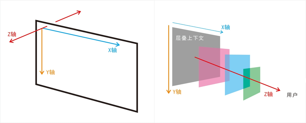
层叠(Stacking)是指一个元素显示在另一个元素上面(即重叠),而层叠上下文是 HTML 元素的一个三维概念,它决定了Web页面上元素在 Z 轴(从屏幕到用户视线的轴)上的显示顺序
每个层叠上下文内部的元素按照自己的规则进行层叠(重叠),而不同层叠上下文之间也是整体相互层叠
下列方式会创建层叠上下文:
- 文档根元素(
<html>) position值为absolute(绝对定位)或relative(相对定位)且z-index值不为auto的元素position值为fixed(固定定位)或sticky(粘滞定位)的元素(沾滞定位适配所有移动设备上的浏览器,但老的桌面浏览器不支持)- flex (
flex) 容器的子元素,且z-index值不为auto opacity属性值小于1的元素mix-blend-mode属性值不为normal的元素- 以下任意属性值不为 none 的元素:
transformfilterbackdrop-filterperspectiveclip-pathmask/mask-image/mask-border
isolation属性值为isolate的元素will-change值设定了任一属性而该属性在 non-initial 值时会创建层叠上下文的元素contain属性值为layout、paint或包含它们其中之一的合成值(比如contain: strict、contain: content)的元素
层叠顺序(stacking order)
当元素发生层叠(重叠)时会按照特定的顺序显示,具体规则如下:
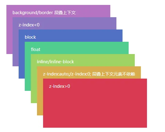
- 层叠上下文中根元素的背景和边框( background/border )
- z-index 为负值( < 0 )
- block 块元素
- float 浮动元素
- inline/inline-block 行内元素
- z-index 值为
auto或0,或者不依赖于z-index( 如:opacity:0.9) 的层叠上下文 - z-index 为正值( > 0 )
- 层叠上下文可以包含在其他层叠上下文中,并且一起创建一个层叠上下文的层级
- 层叠上下文中越靠前显示的元素,即层叠层级(stacking level)越高,如果两个元素的层叠层级相同,则靠后的会覆盖靠前的元素
- 每个层叠上下文都完全独立于它的兄弟元素:当处理层叠时只考虑子元素
- 每个层叠上下文都是自包含的:当一个元素的内容发生层叠后,该元素将被作为整体在父级层叠上下文中按顺序进行层叠
例:
1 | <div style="position: relative; z-index: 1;"> |
PS:尽管 B 的 z-index 是 999,但它是在 z-index 为 1 的上下文中;C 属于 z-index 为 2 的新上下文,因此 C 会覆盖 B
 微信
微信 支付宝
支付宝